

BIT-101
Bill Gates touched my MacBook Pro
I’ve been doubling down on exploring color over the last couple of weeks. In my last post, I described a new app I created to extract a color palette from an image. One thing I mentioned there was that RGB is probably not the best color space to represent colors in when trying to cluster similar colors, as it was not designed with human perception in mind. In this post, I manage to show this visually and come up with a better solution that makes extracting palettes even better. And even to a fancy trick with visualizing palettes. This might be a long one, so strap in.
My palette extraction code was working pretty well. To recap, I was taking each pixel’s RGB values and converting them to 3D coordinates between -0.5 and 0.5 on each axis. The red channel was mapped to the x-axis, green to the y-axis and blue to z. With all the pixels plotted in that 3D RGB space, I applied k-means clustering to find however many clusters I wanted the palette to be. As I said, it was working pretty well, actually miles ahead of everything else I’d tried, but all too often it was missing colors I thought should be in there.
And I didn’t know exactly why. I had some theories:
In short though, I just didn’t know exactly what the algorithm was seeing when it looked at these points. But, hey, I’ve been rendering points in 3D for nearly three decades now. So why don’t I whip something up and take a look?
As I said, I’ve been around the block on projecting 3D points so it wasn’t hard to put this together. I just had to take the RGB coordinates of each color (which ranged from -0.5 to 0.5 on each axis), scale them, apply some perspective, and then plot a point in that color. Once I had that down, I’d be able to rotate, translate, or scale them as much as I wanted, and create an animation. Though technically I considered this pretty simple, I was blown away by what it showed me. I’ll show off a few examples of some differently colored images to see how it visualizes things.
Some of the images I used a lot for testing were pictures of paintings done by two of my good friends, Todd Anderson (https://mstdn.social/@toddanderson) and Jeremy Osborn (https://mastodon.art/@jeremyosborn). They are both talented watercolor artists who post often on Mastodon, each with their own distinctive style and color choices, so it was really useful to see how the algorithm handled their artistic styles. I also grabbed a few images using my getimage tool, and generated some algorithmically as well. First, a painting by Todd.
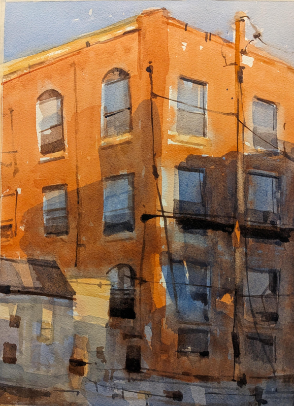
Here, Todd uses palette with lots of browns and reds as well as some contrasting slate blue and grays. Taking all the pixels in this image and plotting them in a 3D RGB space gives us this:
As described earlier, one corner of the cube is black, with the red, green and blue channels moving off on each side. The corner opposite to the black one would be full RGB, or white. I’ve discovered that this kind of distribution is common for visualizing images in the RGB space, a shape that starts at or near the black corner and sweeps up to the white corner, with the stronger colors forming arcs off to one or more of the sides.
Here, I’m also using the RGB color space to run the k-means clustering algorithm to extract an eight-color palette. In addition to showing the palette on the bottom of the image, I mapped the palette’s colors as circles in the RGB space as well. It does OK, but really misses that slate blue altogether, averaging it in with the brownish grays.
Let’s look at a painting by Jeremy with a very different palette.
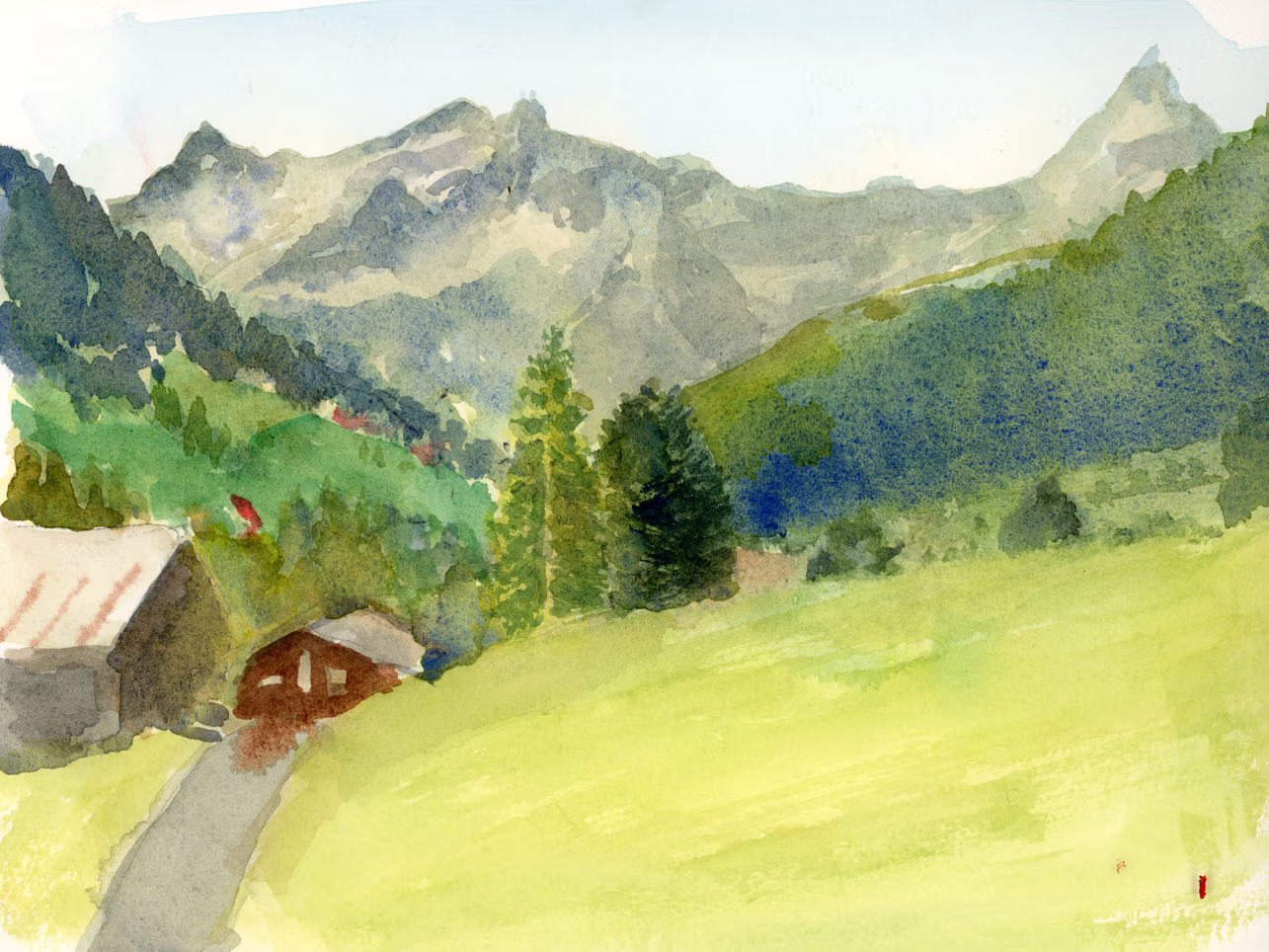
Here we have lots of greens/yellow-greens, some grays and very light blue and a touch of red.
Again we have that sweep from black to white. We pick up a lot of green variations, but just barely catch a hint of blue, and miss the reds altogether, even with an expanded palette of ten colors.
The next example is one I grabbed with getimage. It’s by Anuja Tilj on Pexels, at https://www.pexels.com/photo/a-multi-color-eggs-7987035/.
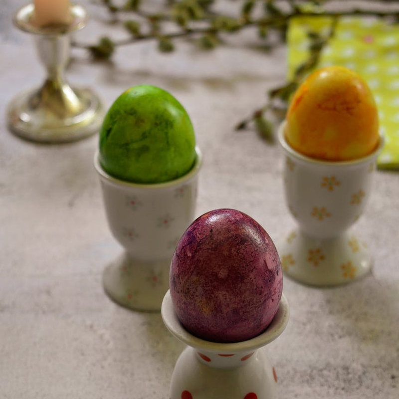
This has strong areas of green, dark reddish-purple, orange and yellow, with a lot of off-white/tan. How does this look in RGB space?
Pretty big fail here. It focuses on finding a whole bunch of shades of brown and tan. The only bright color it really finds is a bit of that yellow. One of the problems here is the way that similar colors sweep along in an arc from dark to light. Because of this, the colors on one end of the arc are quite distant from colors on the other end, and will be averaged in with other closer colors. This is similar to the “two moons” data set, which is a known problem for k-means.
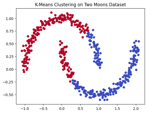
Image from: https://uva-applied-ml.readthedocs.io/en/latest/notebooks/6_kmeans_clust.html
You’d expect each arc to be a related cluster, but k-means works strictly on distance. There are other clustering algorithms that deal with this kind of problem better. But we still have something up our sleeves here.
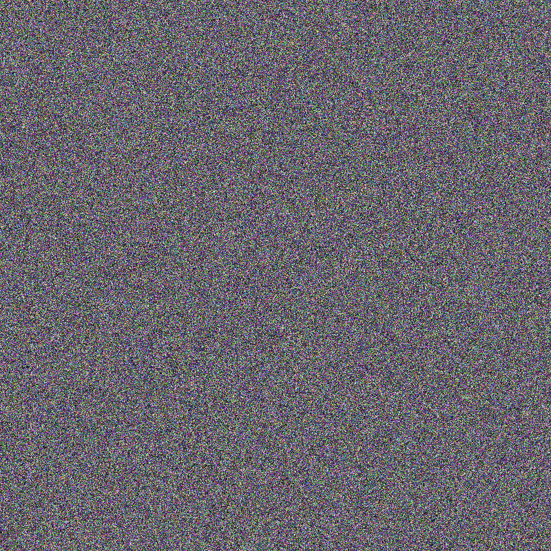
But before we move on, let’s just see a random distribution of points in RGB space. Here I just filled every point in the image with a random RGB color.

And the visualization…
Because everything is very smoothly distributed here, with just about every color represented, the algorithm does a pretty good job at picking out all the different colors and shades.
But what do we do about the failures in the more realistic images? Well, I keep saying that RGB isn’t a great space for this. Let’s try another space.
HSV is another way of describing colors. Think of the space as a cylinder. Going around the outside perimeter, from 0 to 360 degrees we have different hues, starting at red, going through orange and yellow, green, cyan, blue, violet and back to red at 360.
Saturation is how much of the color is there. A saturation of 0 gives you grayscale, where a full saturation of 1.0 (or 100%) gives you the brightest shade of the color possible.
And value is how dark it is. Value 0 will be black and value 1.0 (or 100%) will be bright.
In the HSV space, we can think of saturation as going from the center of the cylinder as saturation 0, to the outside edge with saturation 1. And value will be 0 at the bottom of the wheel and 1 at the top. Here’s a bunch of random color points in the HSV color space.
You can see that colors near the center are grayscale, and the colors out at the edge and top are the brightest and most vibrant. The benefit of this color space over RGB is that similar colors are more likely to be close together. Let’s see how it looks.
First with Todd’s painting…
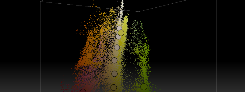
This one kind of blew my mind. The pixel cloud forms a nearly flat plane slicing right through the middle of the HSV cylinder. To me this shows a nicely executed complementary color scheme, with the slate blue directly across from the reddish-oranges, but quite understated, just enough for contrast. It also shows a good range of values from dark to light.
In addition to visualizing the pixels in HSV space, I also changed the palette extraction code (the k-means clustering) to use the HSV space to find the clusters.
The new algorithm did a somewhat better job of getting to that slate blue. But I think the visualization shows that, numerically, there is not as much blue there as the eye sees in the painting. The contrast with the brown/orange makes the blue tint really stand out. But seen in the visualization, there’s really not a whole lot of blue there, and it’s not very vibrant.
Let’s see Jeremy’s now…
Much better performance here. We got the blue, and some of the dark red this time. I’m happy with this.
Also, it’s purely coincidental, but I find it interesting that the visualization almost looks like the scene it is representing. A bit more on that concept later!
And finally the eggs…
A big win here! We got the red/purple, green, orange, and yellow, as well as a range of browns/tans.
All in all, I was very excited about the visualizer itself, and it helped me to see what was going on and improve the palette extraction method from RGB to HSV, which itself is now improved. As I said in the last post, this is never going to be “perfect”, but it’s better now than it was a week ago. I do still need to update the getpal tool to use the HSV method. I’ll do that soon, but wanted to get this post out.
As I was working through the first versions of this tool, I posted some of the videos on Mastodon. Matilda responded with this post:

This concept hit me like a bolt of lightning. Within a fraction of a second I knew exactly how I would do this, and had already started writing the code in my head. Sadly, I was away at a company off site and didn’t have time to get to it for a while. I also wanted to clean up all the visualization and HSV palette code before embarking on a new project. But I finally got around to it a few days later. Here’s the walk-through.
I was all set for this. In 2024 I created a library I called Wire. This did 3D wire-frame rendering and could load and render point clouds in xyz format. While working on that, I’d gathered a few point cloud models. One I used often was a human skull. It was composed of 593,934 3D points. The xyz format is very simple. Here’s a sample from the skull.xyz file I have:
443.25656128 439.81356812 1715.9786377
442.25656128 448.81356812 1715.9786377
439.25656128 459.81356812 1715.9786377
386.25656128 460.95645142 1716.12145996
438.25656128 461.81356812 1715.9786377
420.39944458 463.95645142 1716.12145996
437.25656128 464.81356812 1715.9786377
436.25656128 466.81356812 1715.9786377
374.39944458 469.81356812 1715.9786377
435.25656128 469.81356812 1715.9786377
375.39944458 471.81356812 1715.9786377
434.25656128 471.81356812 1715.9786377
It’s just one line per point, x, y and z coordinates separated by spaces.
There are a couple of problems right off the bat. First there are way too many points in this model. Second, the values are not in a usable range. So I wrote a short program to open the file, read every 50th line and map the coordinates to be between -0.5 and 0.5 on each axis. Then, considering those were HSV color space coordinates, I was able to back port them to hue, saturation and value. Then convert that HSV color to an RGB color and save them all to a file. Here’s a small portion of that file, skull.pal:
...
#67d551,#64d2a0,#f1acb1,#8ad149,#f3a2f2,#5ad75b,#f4a2f1,#68d552,#b3c83d,#70d45b,
#67ceca,#bbc637,#7dd34a,#f3a8c9,#afc941,#cbc149,#98ce4d,#bdc63d,#6bd550,#deb97c,
#8cc5eb,#8bd152,#60d575,#aacb46,#e8b2a2,#beb7f4,#e7b2a1,#dfb87e,#eba6f7,#dfb97a,
#bfc639,#61d3a1,#76d458,#61d57a,#97cf42,#90d143,#76d45b,#79d44e,#e2b781,#60d580,
#b4bafa,#67d39a,#77d459,#a1cd52,#e7b39d,#c4c53a,#e8b39f,#f6a2f2,#5ad858,#f3a4f0,
#c3b6fa,#96cf54,#61d76c,#72d557,#ecb29a,#e7b49a,#8dd243,#a0ce40,#67cfd2,#e8b49b,
#d1c152,#a4cd53,#f4a9cf,#cdb3fc,#aacc49,#a6cd48,#dabd65,#70d568,#f2a8de,#68d764,
#e7b596,#b8bbf6,#77d551,#debb75,#64d85a,#76d55f,#e7b692,#b9bbf9,#bfb9f4,#eeafbf,
#ecb0bc,#84d44a,#cec256,#8bc9e2,#f2a6f7,#6cd76e,#e0adfa,#6ad58b,#c2c741,#9ec3f0,
#cbc44f,#d8bf6a,#7eccdf,#7ad566,#5ed965,#6ad4a4,#64d872,#85d549,#95d24f,#67d4aa,
#cfb5f4,#64d4b0,#61d2cf,#66d0d9,#7bcce4,#c5b9f3,#edb1bf,#96d251,#9bc5f1,#76d762,
#62d4b6,#9dd154,#67d78d,#5dd3cb,#aace4c,#cab7fc,#7ccde0,#a0d145,#83d55c,#70d865,
#61d4bc,#eab790,#eab6a2,#83d560,#e2bb88,#75cfd8,#70d86a, ...
This is a list of with 11,645 color values.
Now those colors were generated from 3D points in the HSV color space, so if I plotted them all in the visualization tool, they would convert back into the original x, y, z points and form a 3D image of a skull!
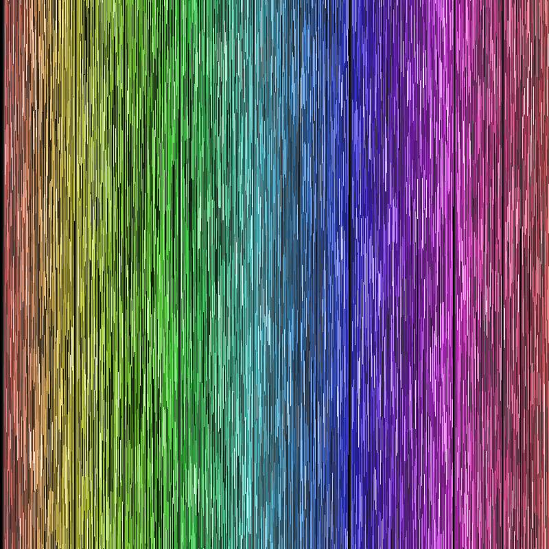
So I created a new image and for every pixel in that image I randomly chose one of those 11,645 values to color that pixel with. This resulted in an image like this:
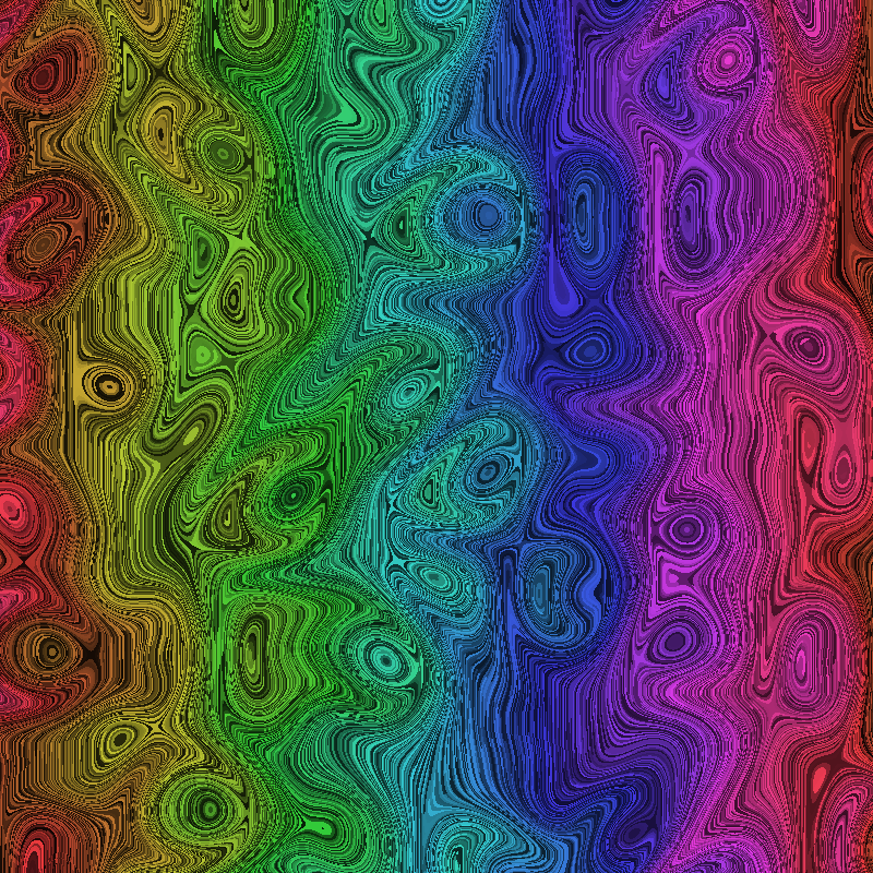
Not very interesting though. So I sorted all the pixels by hue, saturation and value and got this:
Better, but still a bit bland. What if I warped it a bit with some Simplex noise? In this case I let the noise wrap, so that if a pixel is pushed off one edge, it returns to the opposite side of the image. Now we have:
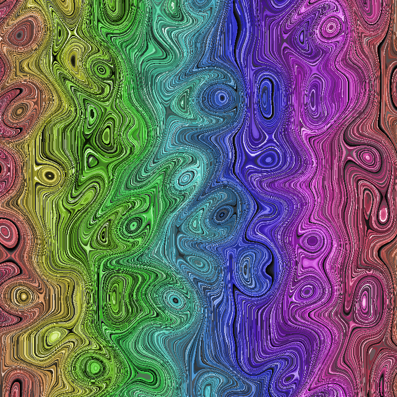
Now that’s nice and funky and should still have roughly the same random pixels from the skull palette. Let’s feed it into the visualizer and…
How crazy is that?
For one more test, I generated 10,000 3D points using a bit of math to make a 3D shape. I converted those points to a palette, sorted and warped it just like the point cloud skull. It looks like this:
Now, if you look at that, it looks pretty damn similar to the image generated with the skull palette. But the colors are slightly different. When you run this through the visualizer, you get:
I could go on, and may post some more examples later, but you get the point.
Is this important or useful? Probably not. But I think it’s cool as hell and I’ll always play with stuff like this.
Shout out for Jeremy and Todd for being nice enough to let me mess around with their paintings. And for Matilda for the spectacular idea. All three are worthy follows on Mastodon.
Comments? Best way to shout at me is on Mastodon ![]()